The New Disney Logo
Hey, who saw Pirates here?
And more importantly, who saw the new Disney logo that appeared in front of it?
Gone are the days of simple graphic logos:
As well as simple graphic stylizations:
And it's turned into this: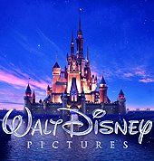
Sorry I can't find a better version but it's definetly more visually busy.
Check out some info about it here. Apparently it was done by Weta. Wait a minute.. don't they have Pixar -and- Disney feature film studios to do stuff like this?
Anyways...
This totally reminded me of Jon Klassen's post on logos designed by Saul Bass.
Here's the logo from Rapunzel Unbraided, while we're on logos:


5 comments:
Hey Mr. Cook,
I noticed that new identity as well when I saw Pirates last week. Why do you think they upgraded the look?
Speaking of Disney and pixar, there is an interview with RALPH EGGLESTON I've linked on my blog, check it out, I would be interested in hearing your thoughts on it.
MD
It's very simple.
It's their way of showing that this is going to be ushering in a new era of Disney.
Imagine if you or your kids in 20 years (more or less) were watching this logo like we watch stuff from the 90s Disney period?
Although, who's sure that they're gonna be putting this in front of every Disney animated feature...just a thought.
Remember who's in charge.
-R.
Yeah, but deep, it's not like the McDonalds logo changed over the last 40 years, I don't see why they'd have to change a logo if it's still working well.
I don't know, I think the longer a logo survives as an icon, the stronger it is. It's failing if you have to 'revamp' it
Good points Robin and Ran,
I have read some books on brand power and how significant an identity is to a company, it's really the foundation on which they stand. It's not uncommon for a company that has been around for a while to upgrage their identity, however I think it might of had something to do with the recent complications with Disney and Pixar: the splitting and coming back together, in many ways it made Disney look vulnerable, especially seeing the success Pixar has achieved without Disney.
Hey Mike - thanks for coming by! I checked out the eggleston interview - definetly nifty stuff - i wanted to go to the MoMa exhibit so bad!
I personally think though that if they don't want to look vulnerable they would restrengthen their principles and go back to basics rather than announce that the company is changing and heading into uncharted waters.
Deep - It's definetly the reason -why- they are doing it, but I definetly see this logo as something that will get outdated.
Robin - I definetly agree with this. Clarity and brand prescence is everything. If you can publish a logo in black and white and incredibly small and still be able to recognize the branding I definetly think it's a sucessful brand. I think it would be silly for Nike or a similar company to update their logo for sheer trendiness. Although they're not changing their logo per se, I still think I prefer the old. Bah humbug.
Post a Comment